Renewables
Solar power vs. the duck
Dates: 2018-07-19
It is not unusual to see people with umbrellas on a sunny day in Arizona. After living there a few months, I too built up the habit of always bringing an umbrella with me if I had to walk far. The sun is powerful in the Southwest, and a source of energy that one can rely on. So much so that the California Energy Commission has decided that all new houses mush have solar panels installed starting in 2020. At Arizona State University where I worked for three years, solar panels are everywhere and the university came in 1st in a 2015 search for the US campuses producing most solar power (nearly 50 percent of ASU’s current daytime peak load).
So what’s the problem?
The energy received from the sun is strong when people are working. When everyone goes home (say at 4pm if you’re lucky) the sun is already low on the horizon and the solar energy production is much reduced from it’s peak at midday. Typically this is shown with an average load curve (or load profile) which is the instantaneous demand as a function of time over a specified time interval. Averaging over a number of days, the load profile for a day might look like the blue curve in the figure below, whereas the profile of solar power generated could be the green curve:
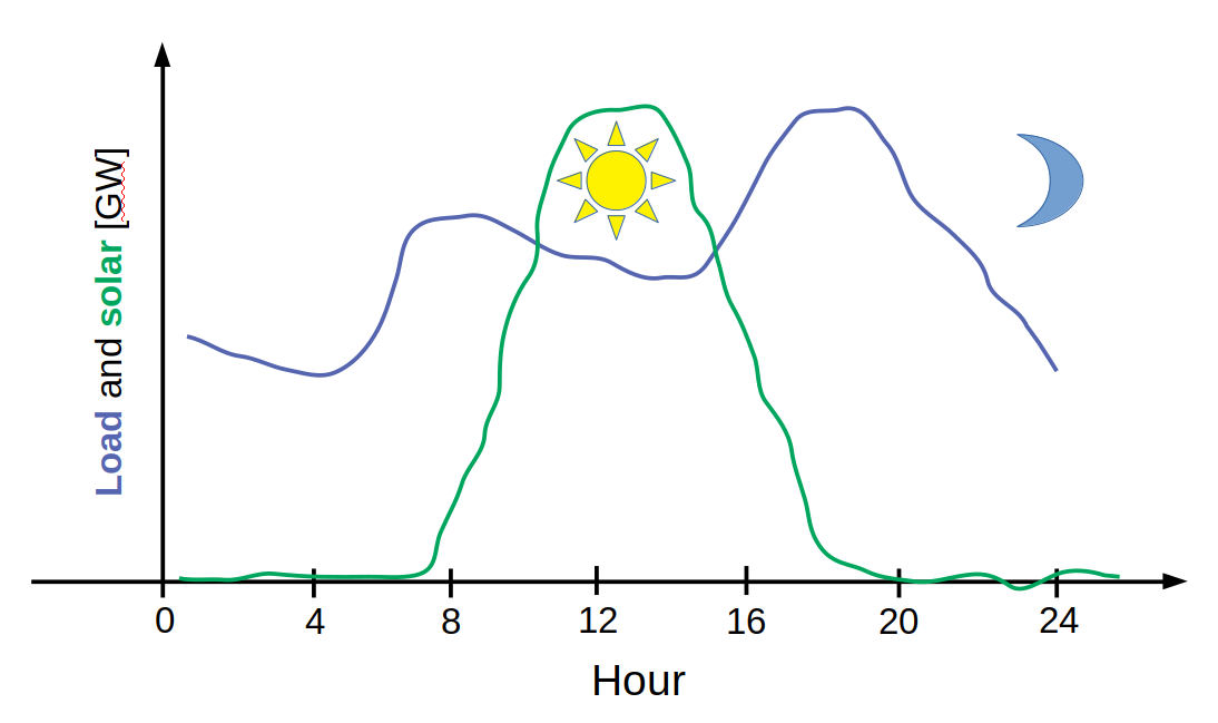
(This is just an illustration I made, but it’s inspired by the expected California 2020 load as shown in Fig. 10 in this paper)
But what happens when you subtract the produced solar power from the load profile? You get the net load curve, which happens to take the shape of… well, a duck:
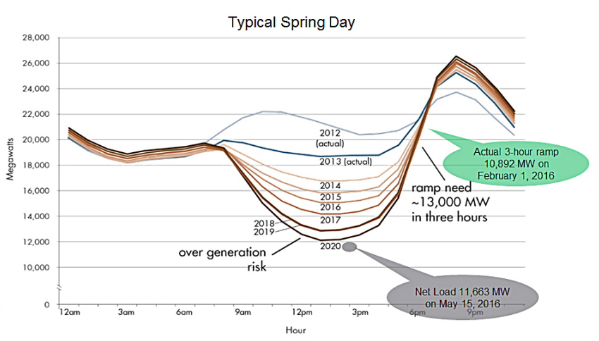
This figure was created in 2016 by CAISO (California Independent System Operator) as a result of predicting future scenarios from current observations. The net load drops during the day to form a “sacking belly”, where solar power is predicted to take up more than half of the total load in 2020. But shortly after the sun sets, the net load starts an incredibly steep ramp that forms the “duck’s neck”. Finally, as people go to sleep, the net load drops again and “The Duck Chart” has been created.
During the short and steep ramps, the demand must be met by generation resources that are either turned on or rapidly accelerated. And these generation resources currently consist of fossil fuel power plants, where ramping (and stopping/starting) is expensive and new territory.
(Btw, oversupply of renewable energy in the “belly of the duck” is also a problem economically, since the wholesale prices can become negative!)
Alternative solutions
There are however several solutions on the drawing board or being tested which I intend to read up on and summarize in a future blog item.
Credits
I was inspired to look into this by colleague Tue V Jensen who mentioned “the duck” to me after which I read this article.